
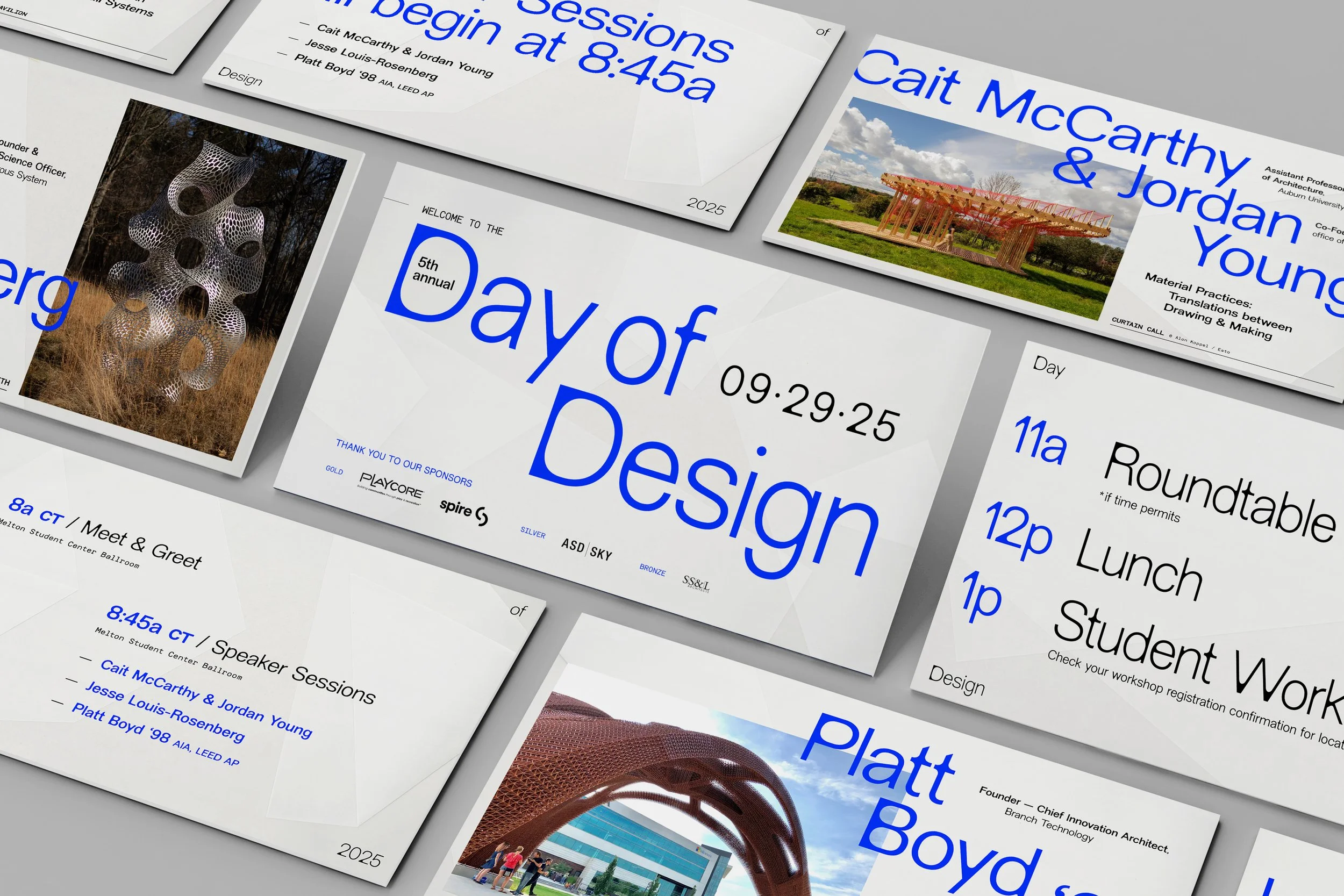
A visual identity exploring fabrication in all forms, applying layered compositions and process-informed typography to promote the fifth annual Day of Design
Silver Award — Day of Design 2025 poster, Graphis Poster Awards 2027, 2026
American InHouse Design Award —Day of Design 2025 poster, GDUSA, 2026
Gold Winner — Day of Design 2025 visual identity, Indigo Design Awards, 2026
American Graphic Design Award — Day of Design 2025 visual identity, GDUSA, 2025
Runner-Up, CQ82 — Day of Design 2025 poster design, Creative Quarterly, 2025
CHALLENGE
The fifth annual Day of Design, held in fall 2025, needed a visual identity representing fabrication across six disciplines—some rooted in physical making, others in conceptual processes—while remaining flexible across a wide range of physical and digital deliverables.
APPROACH
A layered visual system translated fabrication into both material and visual form. Translucent vellum, grid structures and abstract “webbing” were used to represent the relationship between idea and artifact—capturing both tangible construction and intangible processes like iteration and connection.
This system was designed to adapt across mediums, from physically construction pieces to fully digital assets. Tactile elements like hand-applied vinyl and layered materials reinforced the concept in print, while scanned textures and typographic treatments extended the same language into digital spaces.
OUTCOME
The resulting identity created a cohesive experience across all touchpoints, balancing conceptual depth with visual clarity. By bridging physical and digital execution, the system made fabrication visible not just as a method of making but as a way of thinking—connecting disciplines through a shared creative process.
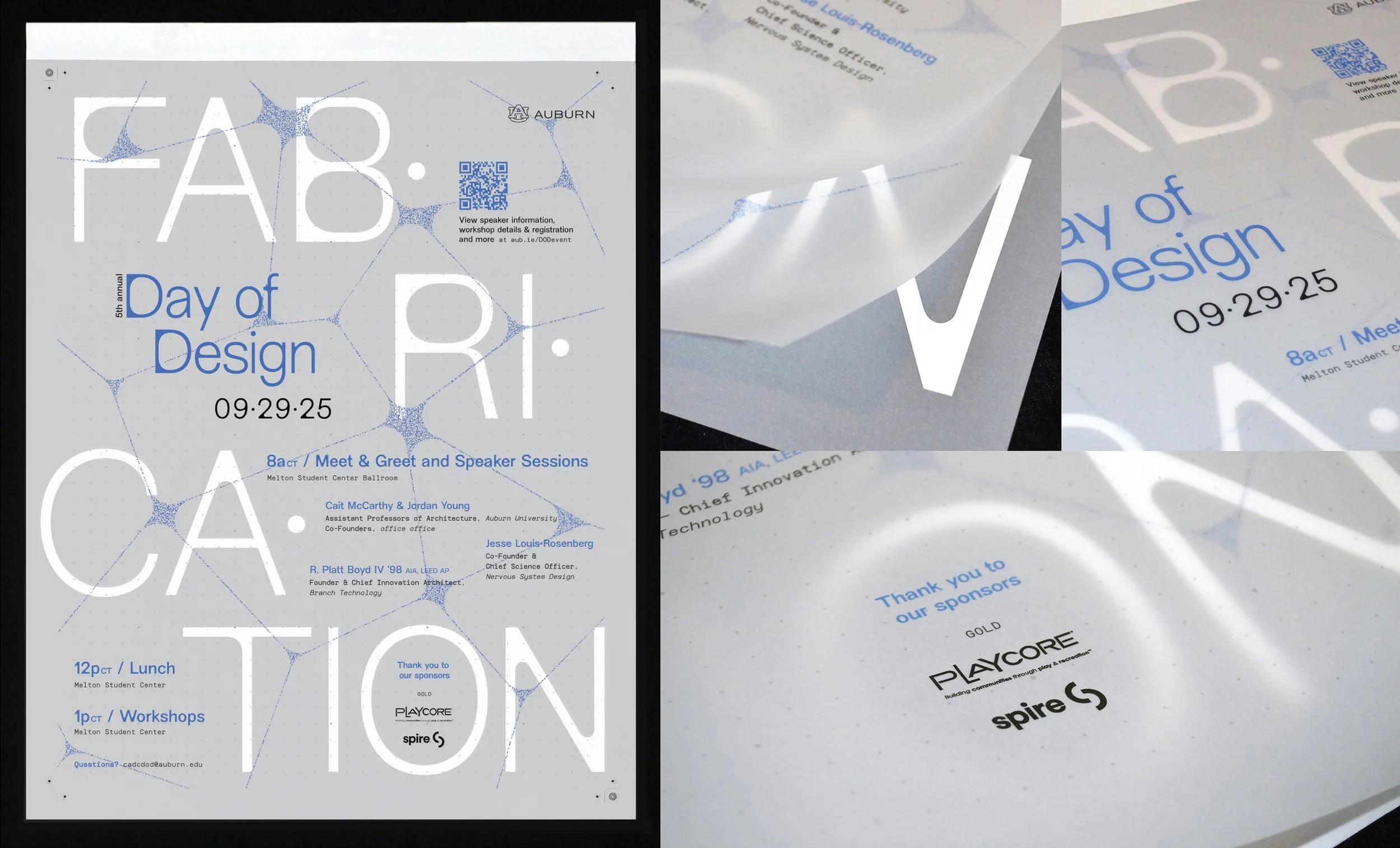
Three layers of translucent vellum invite viewers to physically engage with the act of building, while hand-applied vinyl lettering grounds the composition in material craft. An abstract “webbing” element visualizes the leap from idea to artifact, layered with a subtle grid that references systems used across design disciplines. A clean sans serif typeface—with rounded interior moments inspired by CNC routing paths—created a quiet nod to digital-to-physical fabrication methods. Together, the layers revealed fabrication not just as a process of construction, but as a way of thinking, connecting and making meaning.
Wherever possible, the poster was installed on windows, allowing natural light to pass through the vellum and interact with the layers of the design—creating a backlit effect by day and shifting in character at sunrise, sunset and after dark.
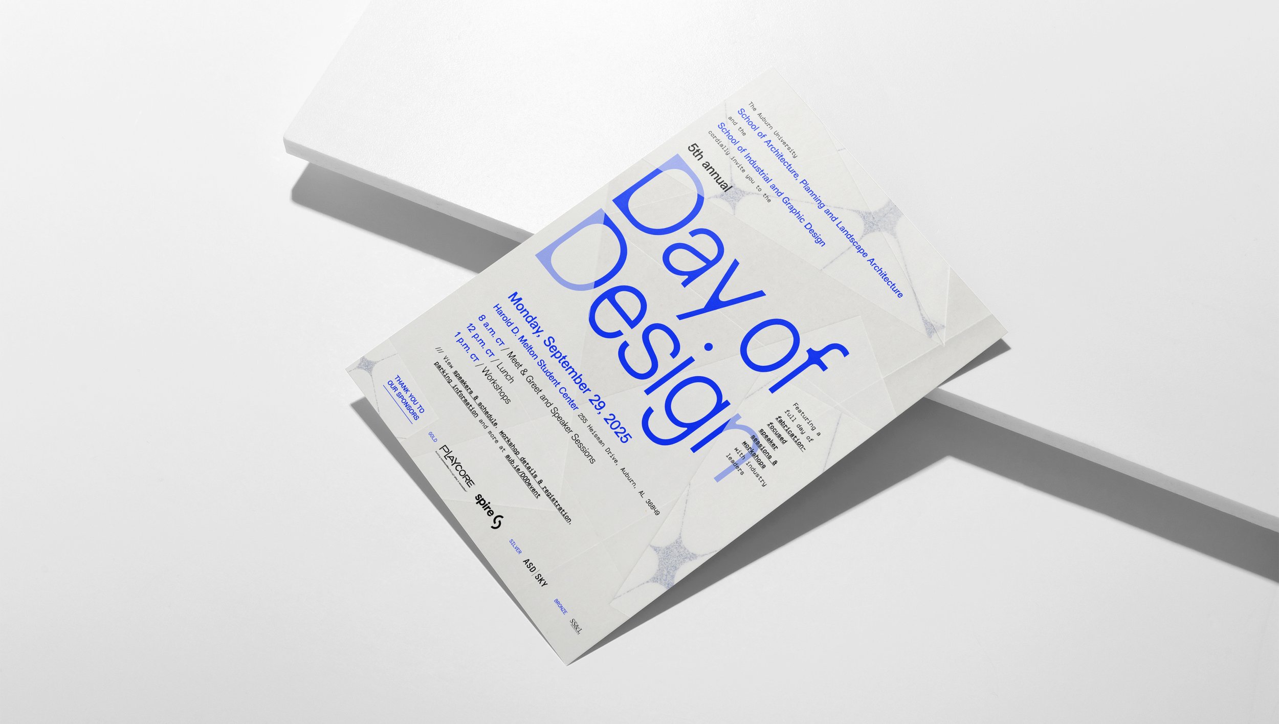
The invitation incorporated the tactile qualities of vellum in a unique way. Folded vellum was scanned and incorporated into the layout, then paired with low-opacity shapes to simulate overlapping layers of material. This approach established the visual language for subsequent digital deliverables and bridged the physical and digital expressions of the system.
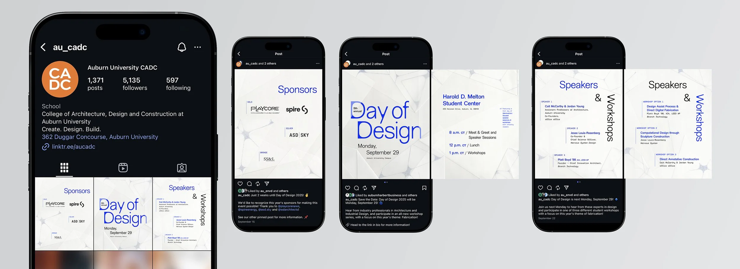
As fully digital pieces, the social media assets extended the material language established by the invitation, incorporating scanned vellum to preserve the layered effect. Three coordinated sets of graphics were developed to pin as a banner on the college’s Instagram feed, with vellum backgrounds designed to connect seamlessly across all three posts as a single composition.
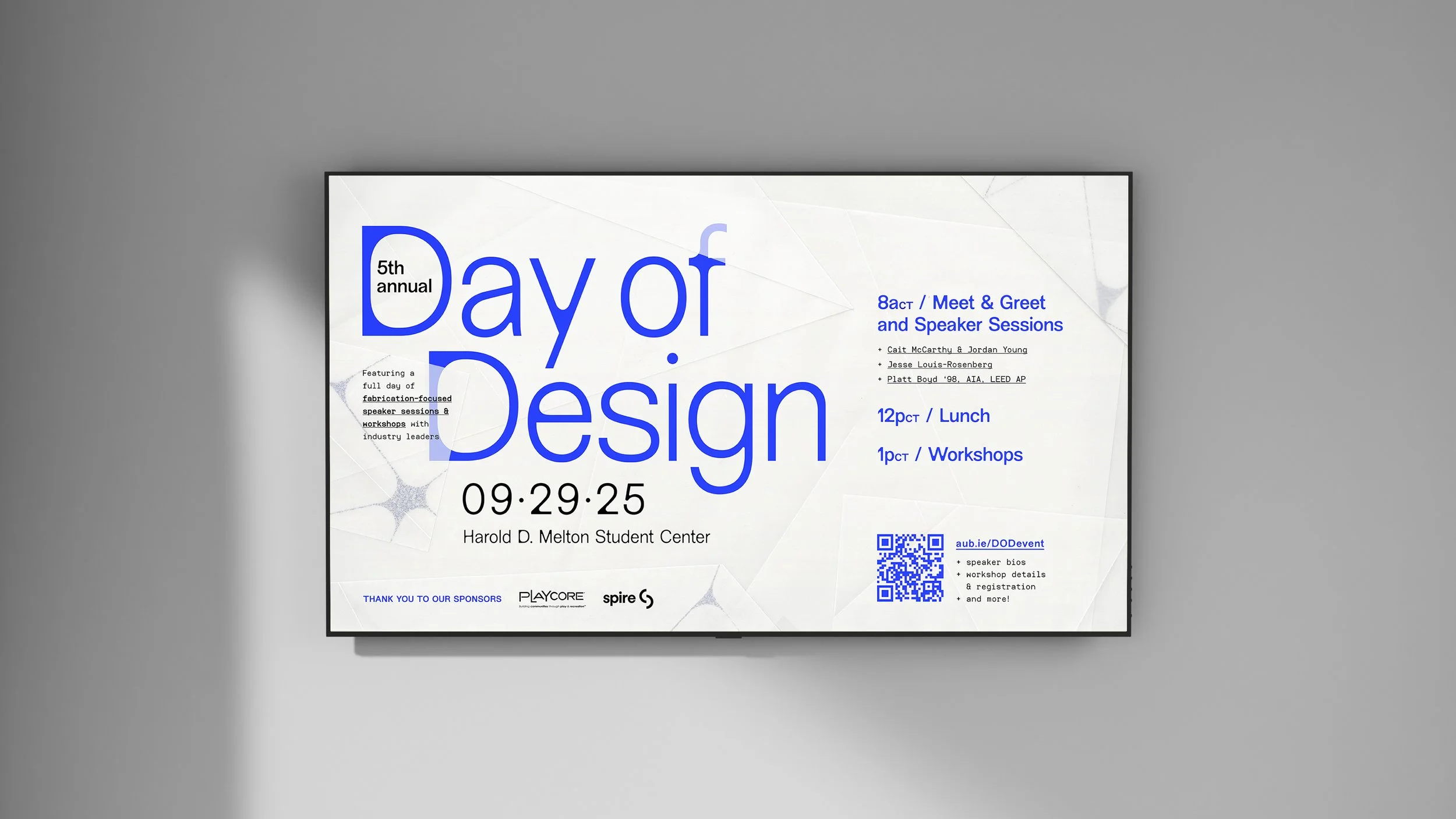
Monitor slides, on display for students the month leading up to the event, carried the same scanned-vellum approach as the invitation and social media graphics.
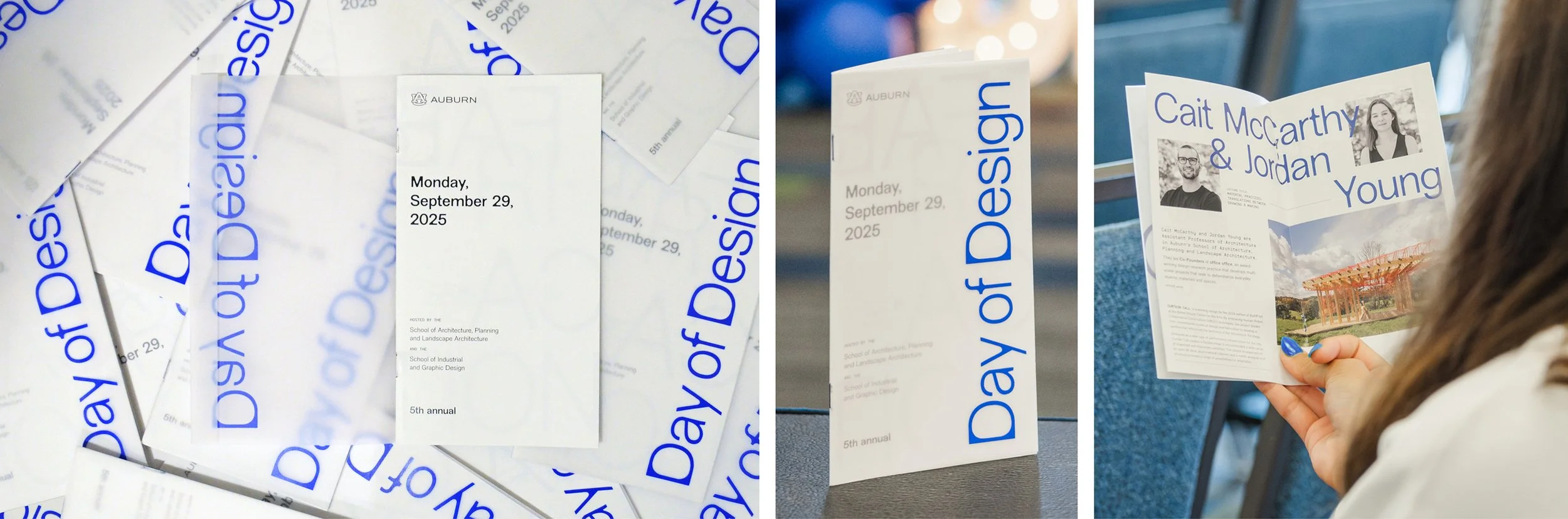
Following the poster, the program became the next major opportunity to experiment physically. While most other assets lived digitally or required only a print-ready file, the program offered another hands-on space to explore materiality and layering in a fresh way.
A saddle-stitched booklet with a vellum cover echoed the poster’s transparency, layering and reveal. Inside, the grid served as both organizational device and subtle texture. Vinyl elements were applied to the cover by hand—bringing the tactile language of fabrication directly into attendees’ hands—and finished with bright blue staples, a subtle, intentional accent that rewarded close attention.
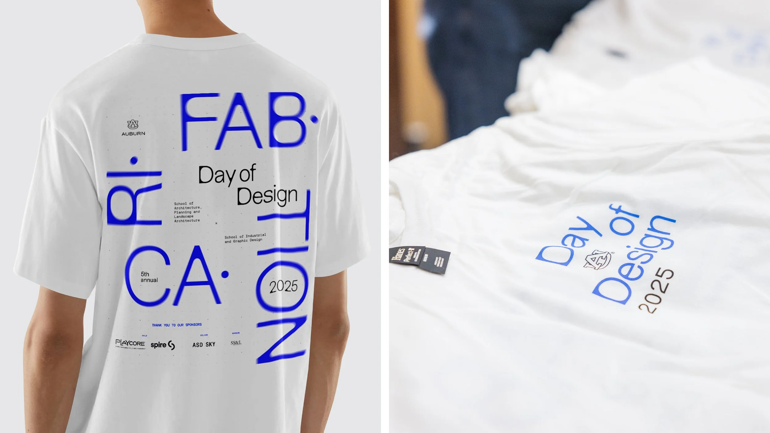
T-shirts, given away to all attendees, incurred production constraints preventing the use of scanned vellum, so the design translated the concept through typography instead: FABRICATION was broken into syllables—mirroring the poster but in a new composition—and treated with a radial blur to echo the layering distortion of vellum, while the grid system introduced subtle texture.
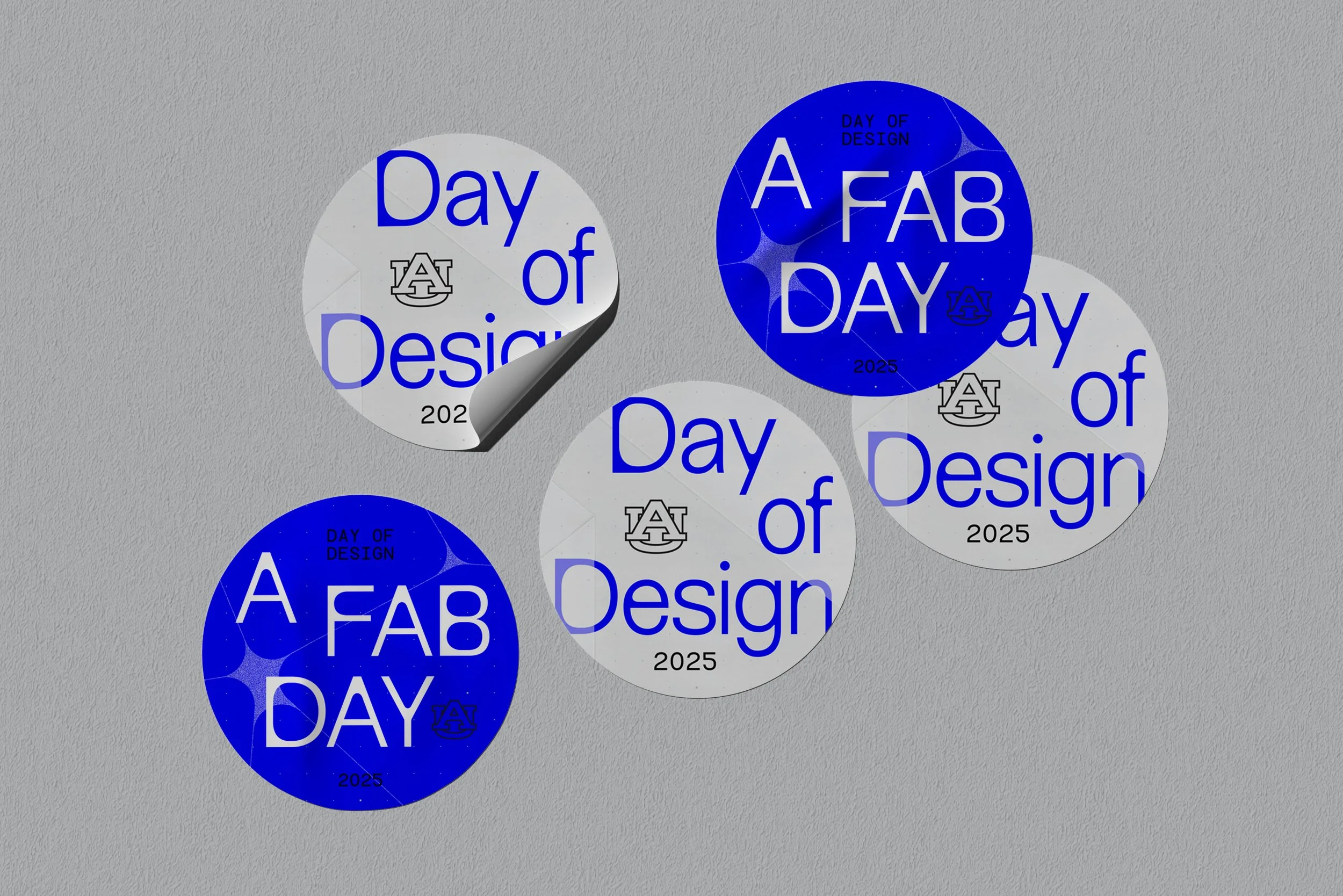
Two sticker variations extended the system—one featuring scanned vellum and the event title, and another using the grid system for a playful, pun-centered option highlighting the event’s theme.
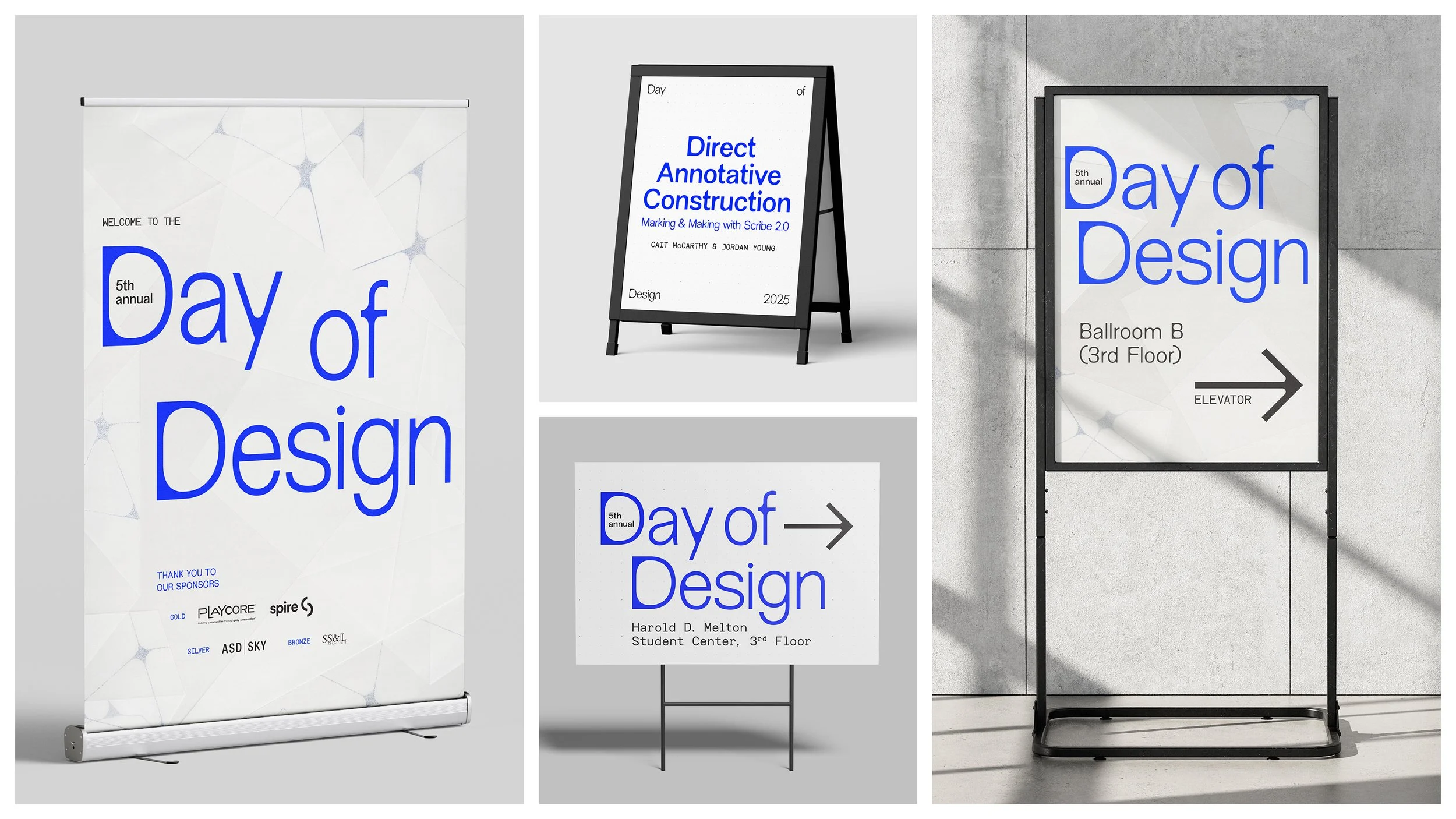
Event signage combined scanned vellum and the dot grid strategically: up-close, larger-scale pieces emphasized materiality with vellum, while deliverables smaller in scale and/or viewed from a distance leaned on the grid for clarity and impact.
The presentation took full advantage of the venue’s massive screens, using bold, oversized text to create impact while maintaining a simple, clear design. Vellum was incorporated subtly, with layered textures that remained understated to account for viewing distance. Slides ran before the event, highlighting the schedule and featured speakers.