
A visual identity featuring layered textures, abstract forms and playful typography to promote the third annual Day of Design, a celebration of architecture and design
CHALLENGE
The third annual Day of Design required a visual identity that felt distinctive and engaging presence for a design-focused audience while still maintaining enough alignment with Auburn University’s brand framework to move through approvals.
APPROACH
The identity was built on a navy background paired with a light yellow from Auburn’s secondary color palette to maintain brand alignment. A lavender accent was introduced as a subtle reference to the College of Architecture, Design and Construction, where graduates wear lavender tassels during commencement ceremonies.
Typography combined the university’s approved sans serif with a condensed serif to create contrast and hierarchy. The visual language layered textures, warped grids and abstract glass-like forms to create depth and movement. Recurring “X” motifs—used to represent interaction and the exchange of ideas—and angled lines based on Auburn’s 3 pillars graphic element were incorporated throughout the compositions.
OUTCOME
The resulting identity balanced institutional constraints with expressive design, creating a visually dynamic system used across posts, digital assets and day-of materials. The layered forms, typography and textures created a distinct visual presence for the event remaining aligned with the university’s brand framework.
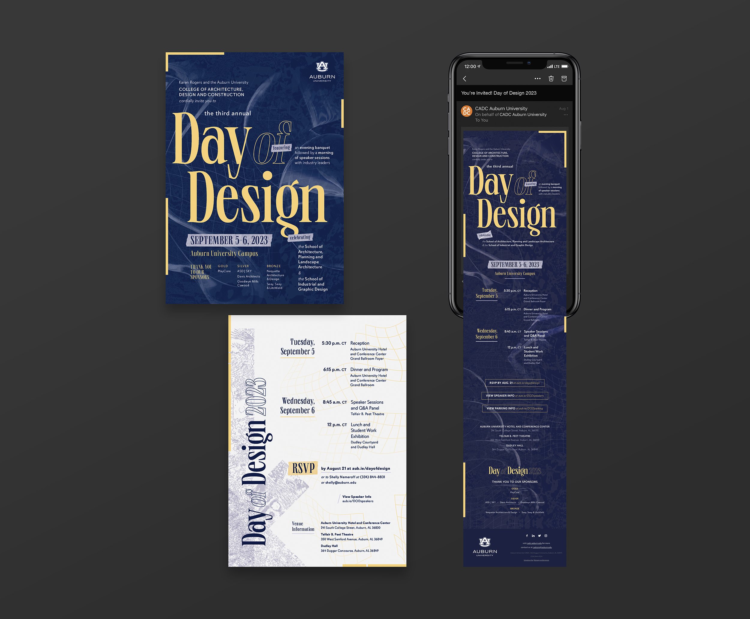
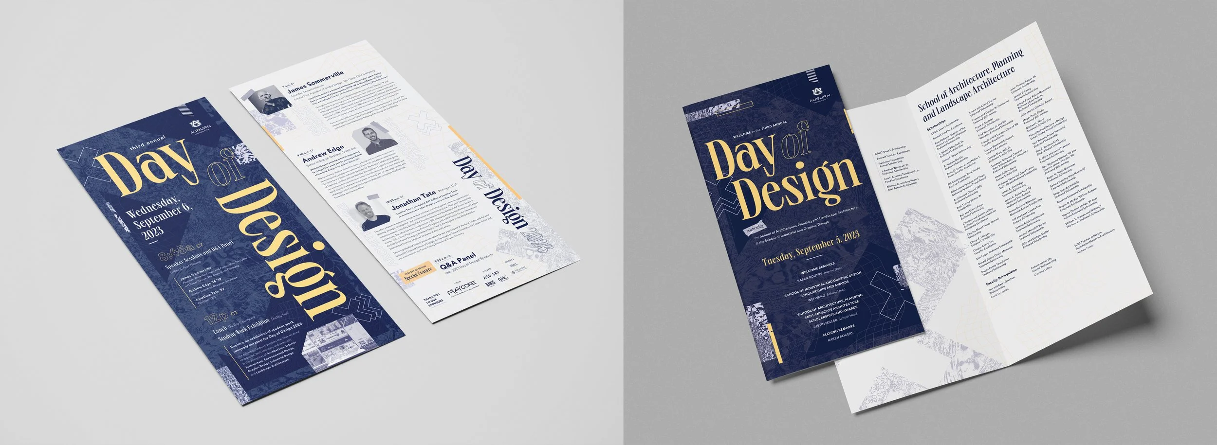
Printed and digital invitations introduced the visual identity across formats, with printed versions showcasing an alternating background and digital versions optimized for email distribution.
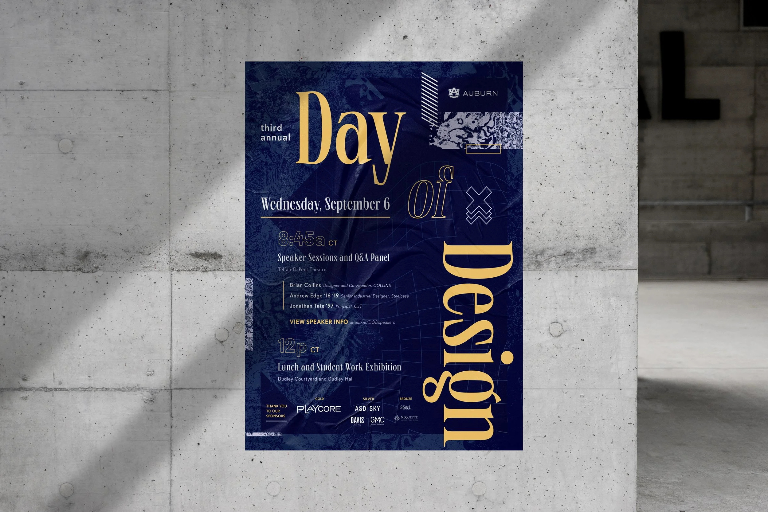
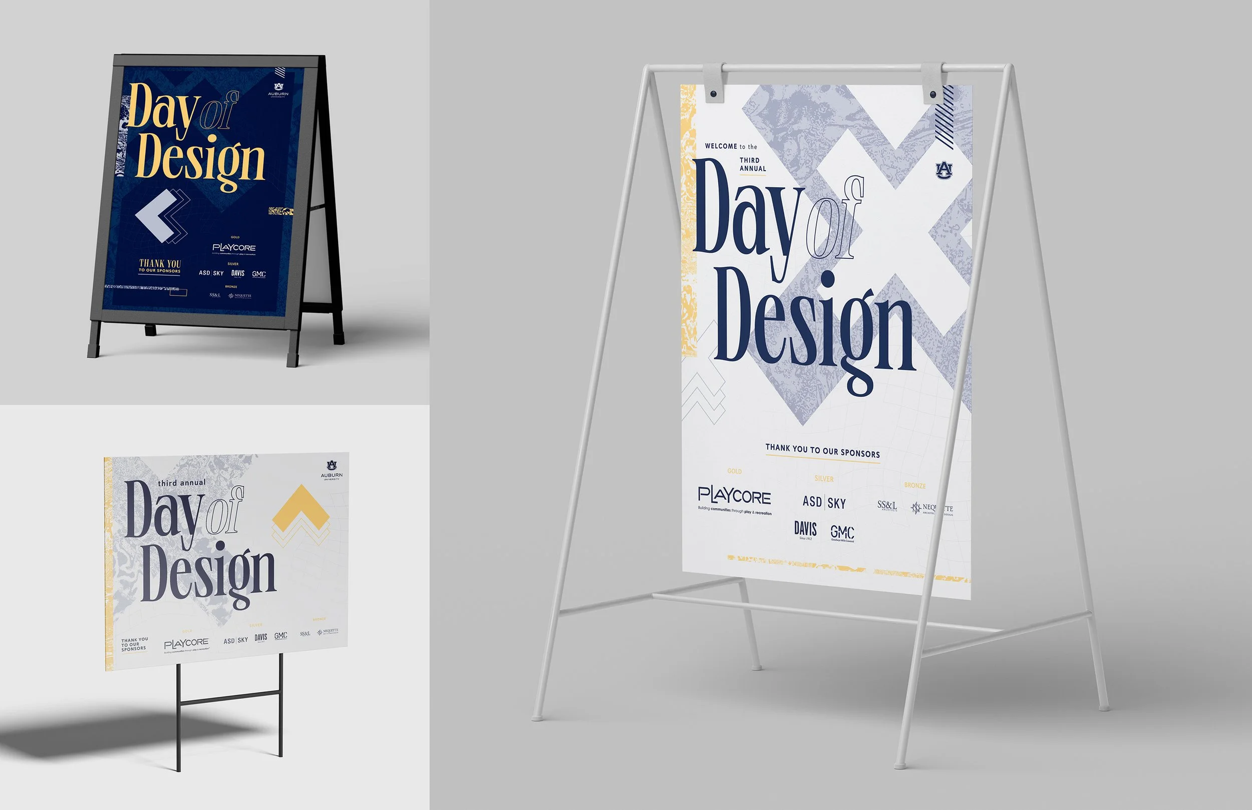
Designed for students, faculty and staff, the poster translated the event’s visual language to a larger scale while clearly communicating all key information.
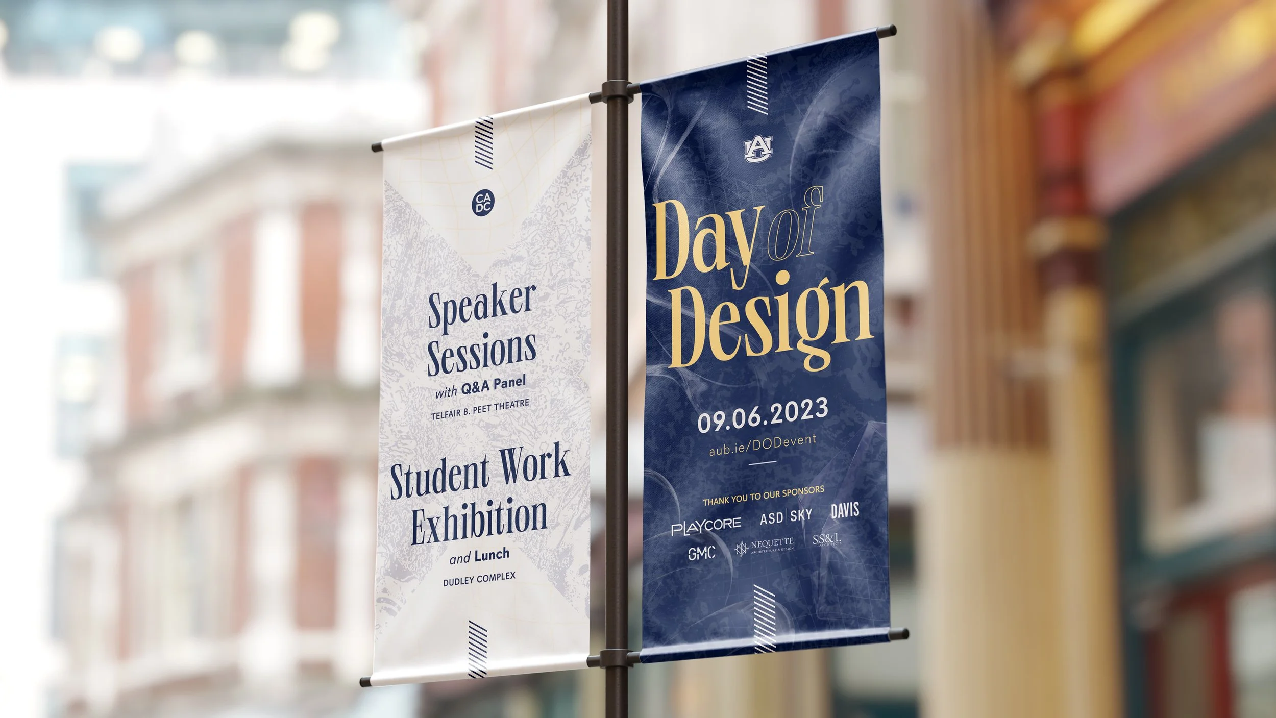
Large, narrow pole banners, displayed on light poles on Auburn’s campus, promoted the event to students, faculty/staff and visitors, emphasizing the event name, date and key features, while keeping sponsors and other details at a secondary scale.
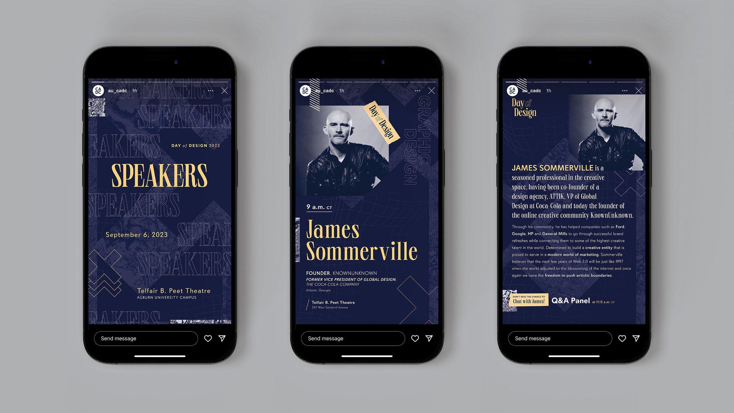
Social media graphics applied the visual identity to story formats, structuring information-heavy content for readability and engagement.
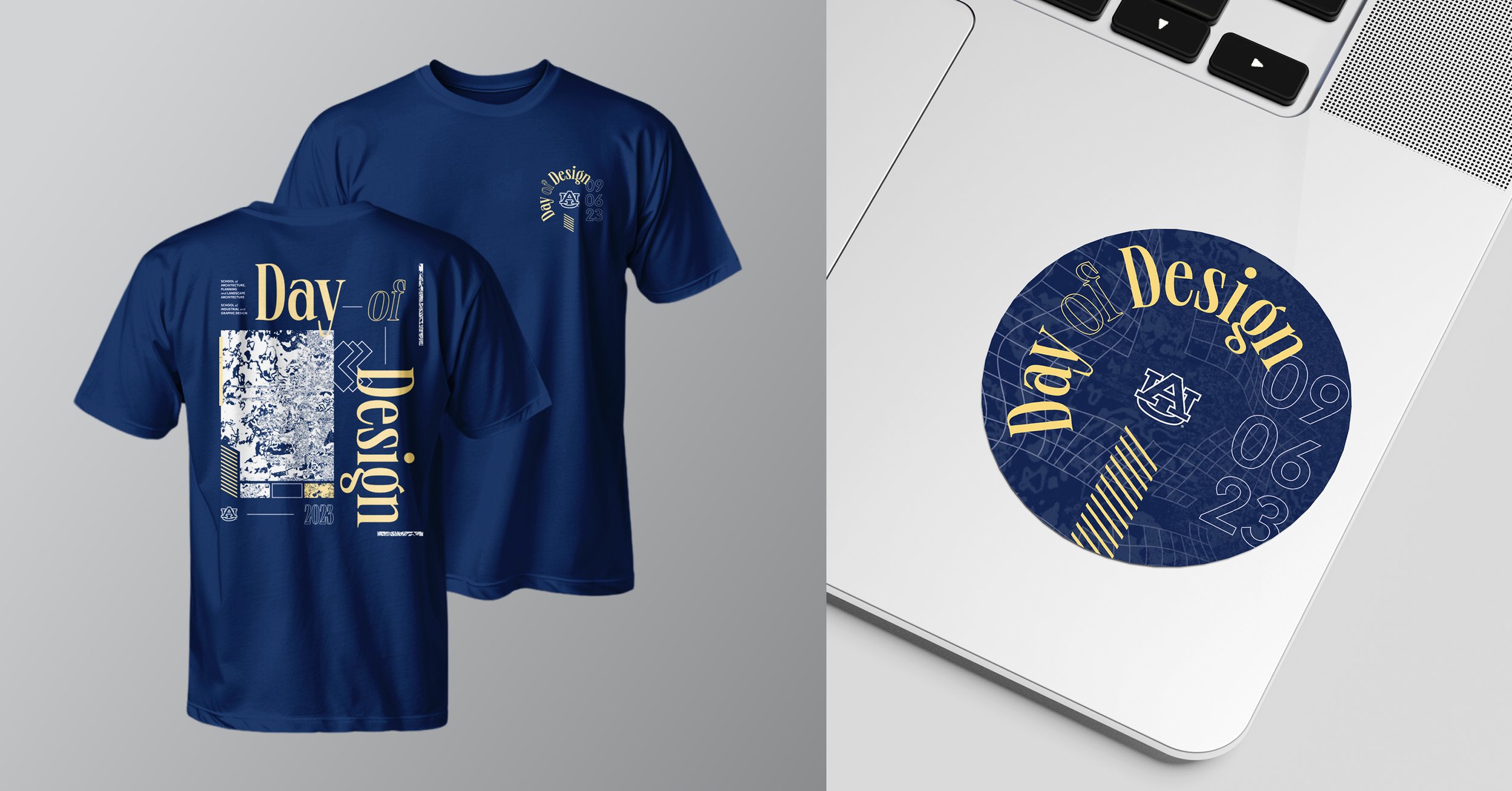
Event merchandise applied the visual identity across t-shirts and stickers, giving attendees a tangible way to interact with the branding beyond the event.
Printed programs carried the identity through both banquet and speaker materials, presenting key information clearly while highlighting layered textures, abstract forms and typographic hierarchy.
Wayfinding and general signage applied the identity system at scale, prioritizing hierarchy and readability while maintaining consistency across formats.
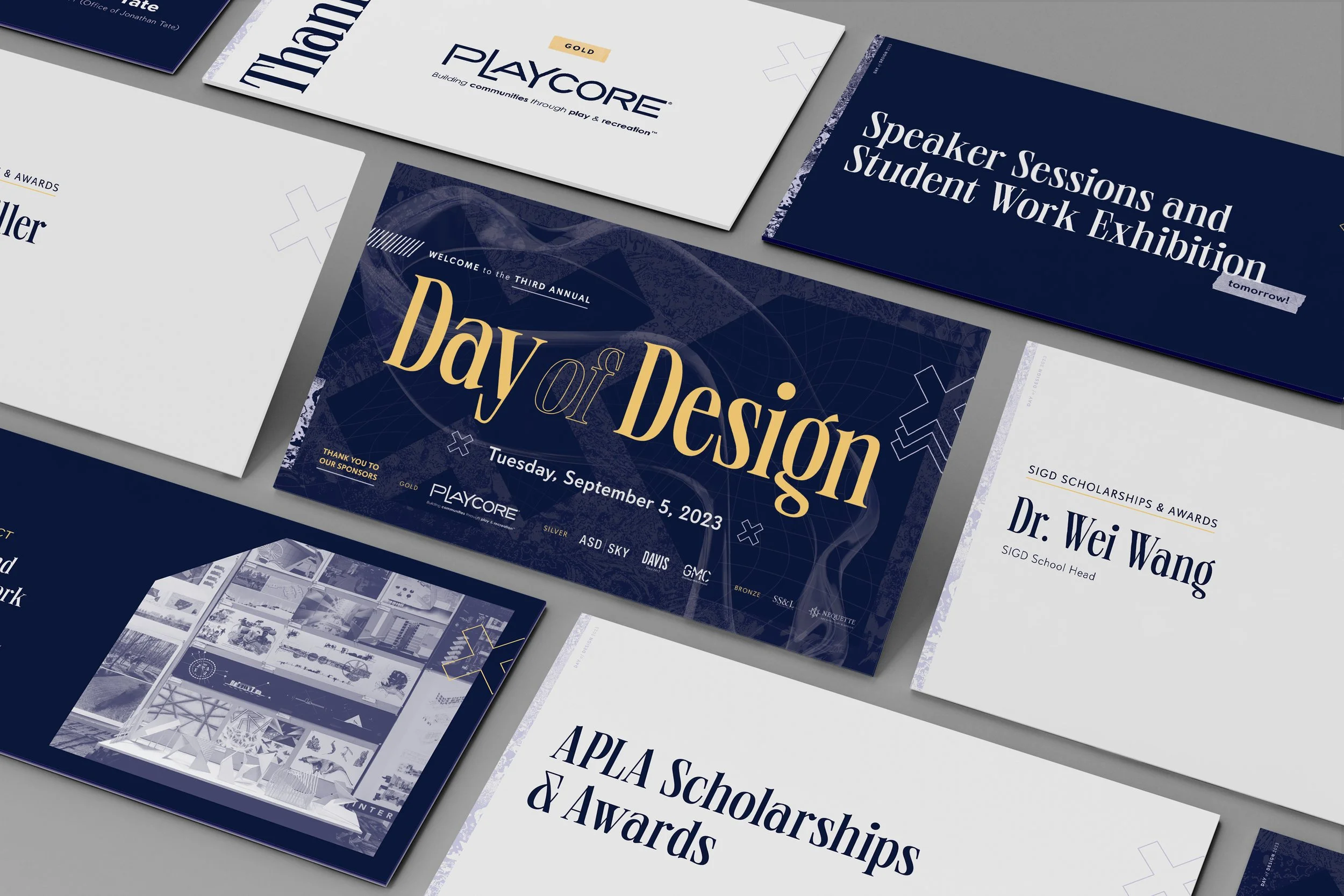
Presentation materials extended the visual language to slides, ensuring clarity and consistency while communicating event information to attendees.